


How to Choose Colours That Work - Weaving Techniques
- Apr 24, 2018
- 4 min read
With the recent release of coloured macrame cords on my shop page I've decided to ask weaving artist Anita Meades, the master behind "bybelladesigns", to share some of her thoughts and processes that lead to her super beautiful tapestry designs. Anita is a master of mood and choosing colours that compliment any home and environment and I'm honoured that she felt she was able to contribute the bellow blog post in the hope to inspire you to experiment with colour
Over to Anita....

Colour...
What determines a successful colour palette?
How should I use colour?
What colours work together and which colours should be avoided?
How important is colour? Where can I draw inspiration? These are questions I often ask myself as I believe that colour is an integral part of any design, it can be a maker or a breaker. I don’t think colour should be overlooked, nor a simple choice, in my opinion colour needs to compliment rather than overpower and should work with your design rather than against. Does this mean that you can over or under use colour? I don't think you can as long as you find a balance. The most difficult part is deciding on just that. We all have our own opinions and thoughts on whats enough versa colour overload. Some of us like it bright and bold, whilst others learn towards a more neutral and softer palette.

I often get ask about my own colour choices and how do I decide on what colour combinations to work with. Honestly, it's a bit of a mix really, if its an existing design then it's more about choosing a palette to reflect a mood or complimenting an interior. If however it's a completely new design then there's significantly more thought and planning that goes into selecting the right colour, shade, tone and texture of yarn. As I said before, colour is an integral part of the design process and in many instances putting togther a successful palette can take longer than the weaving process itself! I will just say though that colour choice is personal, therefore there is no right or wrong method, nor do I believe that any one person has impeccable taste. However I do think there are ways to influence our choices for the better and here are a few ideas on how to achieve just that.
History Is there a particular period in time that sparks an interest? Maybe it's those vibrant and earthy mid century colours of orange and brown with injections of chartreuse, turquoise, red, pink and mint green perhaps. Or move back to the 20s and explore the Art Deco period. Immediately I think of metallics, gold, black and white alongside the deep pinks, jade green, navy blue and sand

Taking a look back at history and looking at the way colour was used in fashion, interiors, architecture and print can all be a great source of inspiration. The fact that we do look back and continue to be influenced by such classic colour combinations tells us how successful they were and indeed still are. Mood and feeling During the design process ask yourself what mood or sense of feeling am I trying to create? If “playful” then to me that would suggest a move towards brights, a mix of colours, a palette that offers contrast and vibrancy.

Or am I wanting to create a sense of calm, if so then initially I would gravitate towards neutrals with only 1 or 2 accent colours for contrast.

Again this is all suggestive and depends upon our own interpretation of how colour makes us feel. Neutrals for some are relaxing and stylish whilst for others dull and boring. Landscape Photography I love landscape as a source of inspiration. I can spend hours looking at photographs of mother nature in all her glory. One of my favourite accounts on Instagram is @saltywings. The photography is flawless and the images are just incredible. Colour bursts of the screen in an array of combinations, a true feast for the eyes. Seriously who else but the natural world could create such a stunning organic canvas of colour......all of course captured by extremely talented photographers/artists.
Travel Taking inspiration from different countries and cultures is a great way to influence a design. You only have to imagine the spice markets of Delhi or the Canadian mountains in autumn and immediately your mind is full of colour. I was recently commissioned to create a tapestry to compliment a Moroccan inspired decor, so fuschia, mustard and grey was an ideal choice.

Paying attention to how colour is used within textiles and decor from places around the world may offer up combinations that you may have never considered previously.
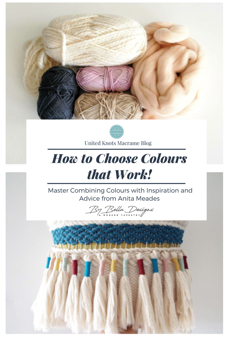
If it works it works... Then there are tried and tested favourites of mine. Probably my most used and requested colour palette being one of white, navy, gold and blush. Just add in a little tan, dusky pink and grey for and a winning combination every time.

Find out more
Anita's beautiful work and photography is available on her business website here:

You can also follow Anita' s regular updates and creative adventures here on her Instagram page
Feeling Inspired ?


Loved this article and want to contribute? Never blogged before but feel nows your time to let your writing shine?
To find out about the exciting opportunities coming up, go to my Services Page and start your message with "Hi Robyn!
HELP MAKE MORE ARTICLES LIKE THIS POSSIBLE,
LOVE IT, LIKE IT, SHARE IT, EVEN SAVE IT FOR LATER! USE THE BUTTONS BELOW >>
ATHE assignments often involve complex topics across multiple fields, making them challenging to approach. ATHE Assignment Help offers clear guidance and step-by-step explanations, helping students understand difficult concepts and structure their work effectively.
Rapid Assignment Help ensures assignments are delivered on time with high-quality, well-researched, and original content. Their attention to detail and professionalism significantly enhance academic outcomes. This service is highly recommended for students seeking expert guidance to improve performance and understanding.